Originally published at: https://boingboing.net/2018/07/02/animated-income-mountains.html
…
3 Likes
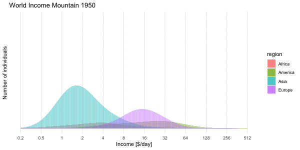
This doesn’t illustrate the data, it obfuscates. We can see the mountains squirm, but it would take some real headscratching to figure out what, if anything, it all means.
4 Likes
Yeah, “stacked” plots like that are a terrible idea 100% of the time. The curves should be superimposed, or expressed as fractions at each income level
3 Likes
We’re in luck. The creator, responding to comments in the original link, provided just such a version here: http://staff.math.su.se/hoehle/blog/figure/source/2018-07-02-factfulness/moving-mountains2.gif
I’ve watched the damn thing over and over and there’s a lot to be digested in it. I think the biggest question I have is what happened to Europe Starting about 1990 - there’s a substantial flattening of their curve, pushing people away from the peak in both directions. This would be just after the fall of the Berlin Wall, so I can at least posit that it has to do with mainstreaming of the eastern-bloc economies but I can’t fully develop the connection in my mind. Thoughts?
1 Like
This topic was automatically closed after 5 days. New replies are no longer allowed.