Originally published at: The 60-30-10 percent rule of color | Boing Boing
…
6 Likes
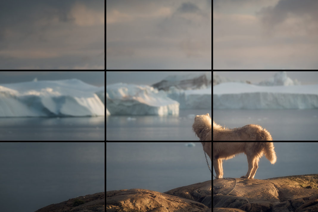
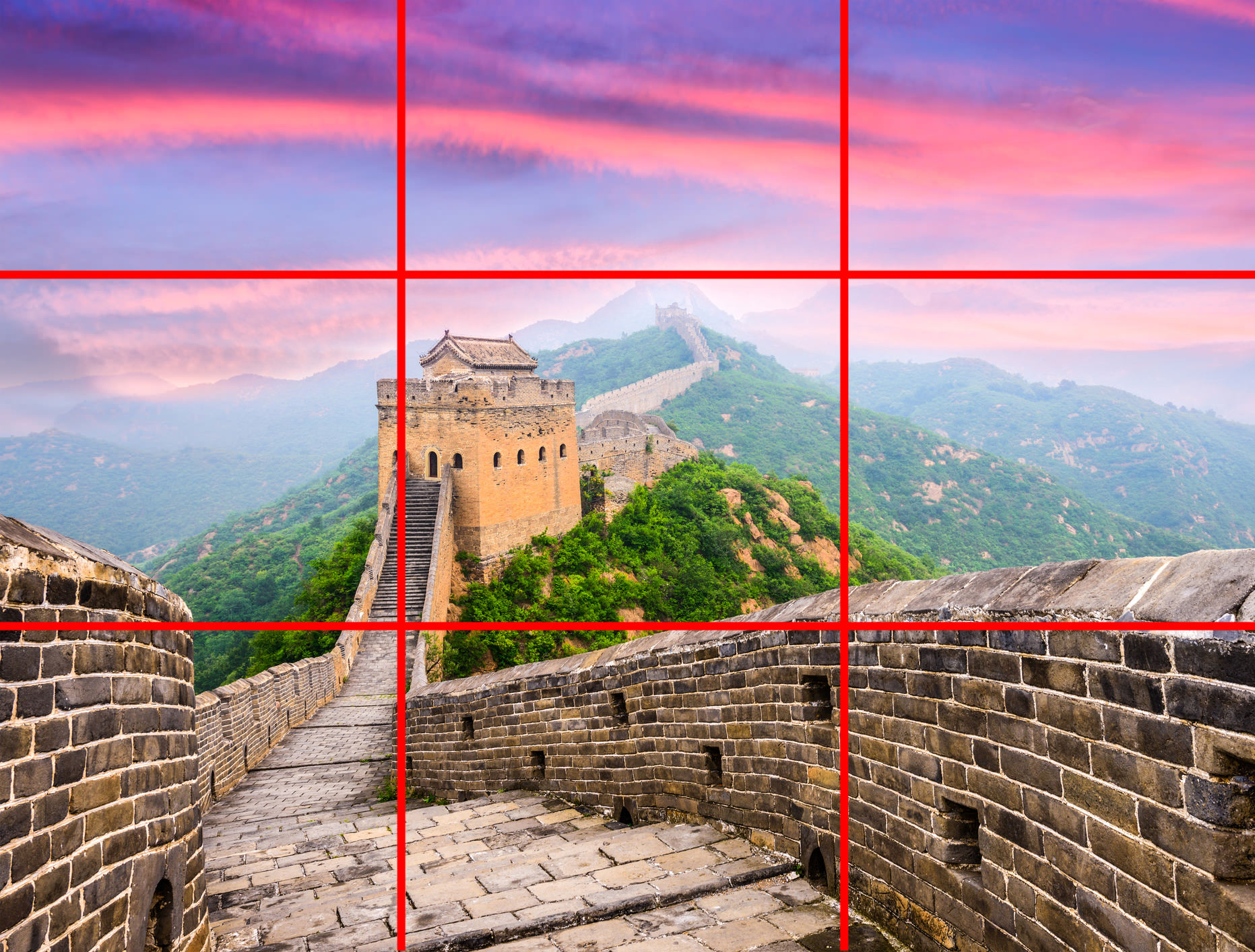

I call bollocks. Bollocks to the rule of thirds. Divide your picture into thirds. If there is something interesting close to any of the intersections, then I win. Or, maybe I can find the Golden Ratio instead. Bollocks to the 60:30:10 rule. One colour is used more than the others, the remainder is mostly another colour, and you can find a little bit of third. You can include or exclude white and black if it is not coming out the way you want. Amelie used four colours for some scenes, but they argue their way out of that.
I am not saying that these rules may not have their uses. When you are staring at a blank sheet of paper, any idea that gets you started is a good rule. But I don’t think there is any good theory behind it.
3 Likes
I’m not sure what you’re driving at with your comment. That the entire structure of aesthetic composition doesn’t actually exist? Or that the “Rules” designation is overblown?
We could call it “‘Guideline generally accepted as being aesthetically pleasing to the majority of people’ of Thirds” but that doesn’t quite roll off the tongue as well.
Most peoples’ photos would be vastly improved if they considered some (any!) of the composition elements available before they point and shoot. I’ve rarely ever seen a photo that really caught my eye that was composed by accident.
11 Likes
If you don’t follow any of the guidelines millions of artists have developed over the last few thousand years maybe that’s why your art looks like shit.
9 Likes
Yeah, it’s worth flipping a table every once in a while that if you take a clinical image and cut it to 4 inset points of interest in a consistent fashion it’s a better image.
Also that next ep. of Centaur World I get to go spot the 60% flat colors. (Lead character is a gray mare, so that’s the 30.)
5 Likes

That’s a Jeff Koons’ Balloon Dog by the look of it, what’s your point?
5 Likes
Marry a porn star?
1 Like
Was I driving at anything? I confess was mostly reacting to the video presenting a rule of thumb for design as though it was some immutable law, and then cherry-picking their data to fit. Any scientist might do that, My kids were taught the rule of three when they went to Art College, along with Colour Harmonies as equal angles on the colour wheel.
People have tried to measure what we see as harmonious. A friend of mine worked on where pictures ‘balanced’ - if you were to imagine a pivot that the image stood on, what is the ‘right’ place? He came up with an algorithm, but the point was not at the golden ratio, or the 2/3 point, but depended on what filled the part of the image. Dark colours, and saturated colours seemed ‘heavier’. This is much, much better than saying the image should be divided in a 2:1 ratio or a 1.61803:1 ratio, without proof or argument.
Okay, maybe I came on a bit strong. Know these guidelines by all means. But creative art is not about obeying static laws, and maximising your harmony.
1 Like

IMO, there are no ‘set in stone’ rules when it comes to making art, but guidelines are extremely helpful in the quest to make good/meaningful art.

3 Likes
This topic was automatically closed after 5 days. New replies are no longer allowed.