One vote for a map that is - and I know this sounds crazy - the actual real-world route the trains take.
This is a thing of beauty.
I kinda think this distorts the geography so much as to make it unusable. It’s pretty but confusing.
I have a map of the world, it’s life-size. It reads:
1 Mile = 1 Mile
So I take it you haven’t looked at the official NYC subway website in a while, or ever, as there is exactly that map already available: http://nycsubway.org/wiki/New_York_City_Subway_Route_Map_by_SPUI
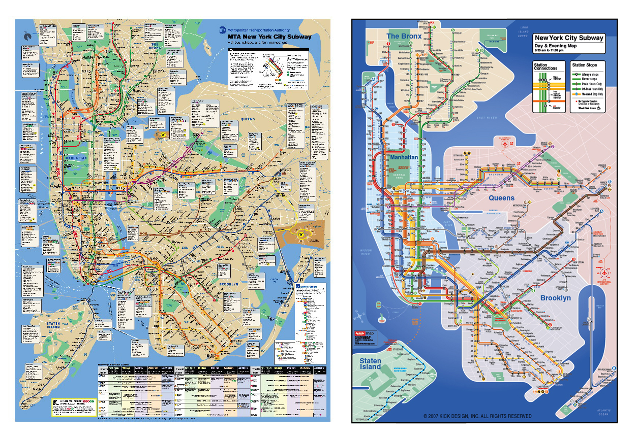
People who actually live in New York prefer maps that have more geographical realism since subways are a means for getting places that 99% of the time exist above ground. The concentric map looks neat but is pretty useless for determining how to actually get to a place, not to mention the amount of time involved.
I spent a year living in Brooklyn back in the 80’s. The subway map always seemed clear and easy to use as it looked like a real map. This thing would be very confusing.
Thank you for bringing that lovely map to my attention, but there’s no need to cop an attitude about it.
Especially since - and as that site itself makes crystal clear - that is NOT the official NYC subway website, NOR an official map.
IS this one even that accurate, though? Seem like an awful lot of hard-right-angle turns for trains to be taking at speed.
Hrm. London one seems to fail because he’s forced an Underground-sign-shape to appear in the middle…
The attitude was only because I googled “Geographically accurate nyc subway map” and it’s the first hit. If you really wanted one, well…

And actually, it is! There’s a surprising number of 45-degree turns in the subway system, which most riders use to tell where they are in the route. I come into the city on PATH and I always know when we’re about to hit the 1st manhattan stop by the sharp S-curve we hit before the announcement. After a while the swaying becomes second nature.
I quite like the MTA map–and I’ve only lived in NYC for two years, during which the relatively accurate relationships between above-ground destinations has been very helpful to me. Is it possible NYC residents do so much walking that that’s a style of map better suited to them? In any case, I was never confused by it, but the above-linked spiral nightmare has me feeling a little seasick.
Oh, good — a map that will render the already addled tourists who clot my beloved city even more confused about where they are and how to get where they’re going. Yeesh! This is lovely, and so is Brasilia, and neither of them work worth a damn. Anyway, for those who would like to see a genuine improvement on the official MTA map, I suggest the Kickmap. For those who are into this topic generally, here’s a collection of true-to-life subway maps, to scale, from cities around the world. (Interesting how closely the New York and London maps resemble the real thing, despite their completely different approaches.)
And for the record, Boston had the absolute worst subway map ever, anywhere. Only during the recent redesign did the MBTA even think to include, for example, the large river that divides the metro area in half.
I come here to learn what is to be learned. In this case I learned that the masculine attitude of wanting to be the master of all situations is not an attractive quality when exhibited in the herd.
Perhaps the difference is that New Yorkers don’t get around the city only by going into a hole in the ground and coming up somewhere else. We walk, extensively. And we use busses. As a result, we actually care about the physical locations and distances. A map which obscures this does not serve us well.
Specific counterexample: Boston primarily uses a distance-and-direction-distorted schematic map, like the London map. As a result, for many years I wasted huge amounts of time and some money taking the Boston subways between places that were not only walkable, but could in many cases be reached as quickly and easily by walking.
I have no objection to giving tourists “enter this hole, leave that hole” directions. But for anyone who actually wants to spend more than a few days, and/or who wants to get to places other than a few Primary Tourist Locations, I would argue strongly that the schematic maps are a net disservice… or at the very least that both should be easily available.
[* Noo Yawka by birth, Bwahstonian by adoption; I recognize the flaws and strengths of both.]
There are certainly sharp turns in the Boston system, as a result of having to fit it around existing infrastructure. Trains slow down at those turns. And screech a lot as the wheels rub in ways they weren’t really supposed to.
I can’t cite specifics, but I wouldn’t be at all surprised to find similar cases in NYC, for similar reasons.
At the risk of getting off-topic…what?
I strongly disagree here. When I teach information graphics to my design students I often use subway maps as an example of how to get a message across more clearly by leaving out all irrelevant information.
Unlike a road map, it doesn’t matter to a subway patron if a map is geographically accurate or presented to scale. Any twists and turns a track may matter not to a rider who just needs to know which lines connect to which stations.
If you need to know how to find any location in a city then get a geographically accurate map. If you need to know how to get from one subway stop to another then something like this one is the way to go.
that one stinks.
this one is way better - http://www.nycsubway.org/wiki/New_York_City_Subway_Route_Map_by_Michael_Calcagno
I’ll have to disagree with you here. Getting around NYC typically involves at least two modes of transportation–subway and walking. That a single map might provide you with enough information to be successful in both modes seems to me to be superior to the idea that one should get a second map for the second mode.
By the way, I don’t believe that the MTA map is either accurate to scale or that it shows a lot of detail in the twists and turns of the tracks–it tries to more or less gracefully connect above-ground points on a map that is still useful as a rough street guide.