Originally published at: http://boingboing.net/2017/08/01/dataviz-ducks-when-designers.html
…
2 Likes
Before i changed careers i was doing graphic design and i was a big proponent of subtle design choices and keeping things simple. Clients love being obvious, tacky, and throwing as many ideas at the wall as possible. I’m glad i’m not doing freelance graphic design anymore.
13 Likes
There’s a great blog (with an amazing URL) for this kind of thing: WTF Visualizations.
5 Likes
I teach an information design class so this issue is near and dear to me. The Tufte essay about that duck is one of the first reading assignments for the class. Even so we usually have at least a few students who really REALLY want to stick with a bad idea for a chart that can be forced into a ham fisted illustration that relates to the topic in some way.
2 Likes

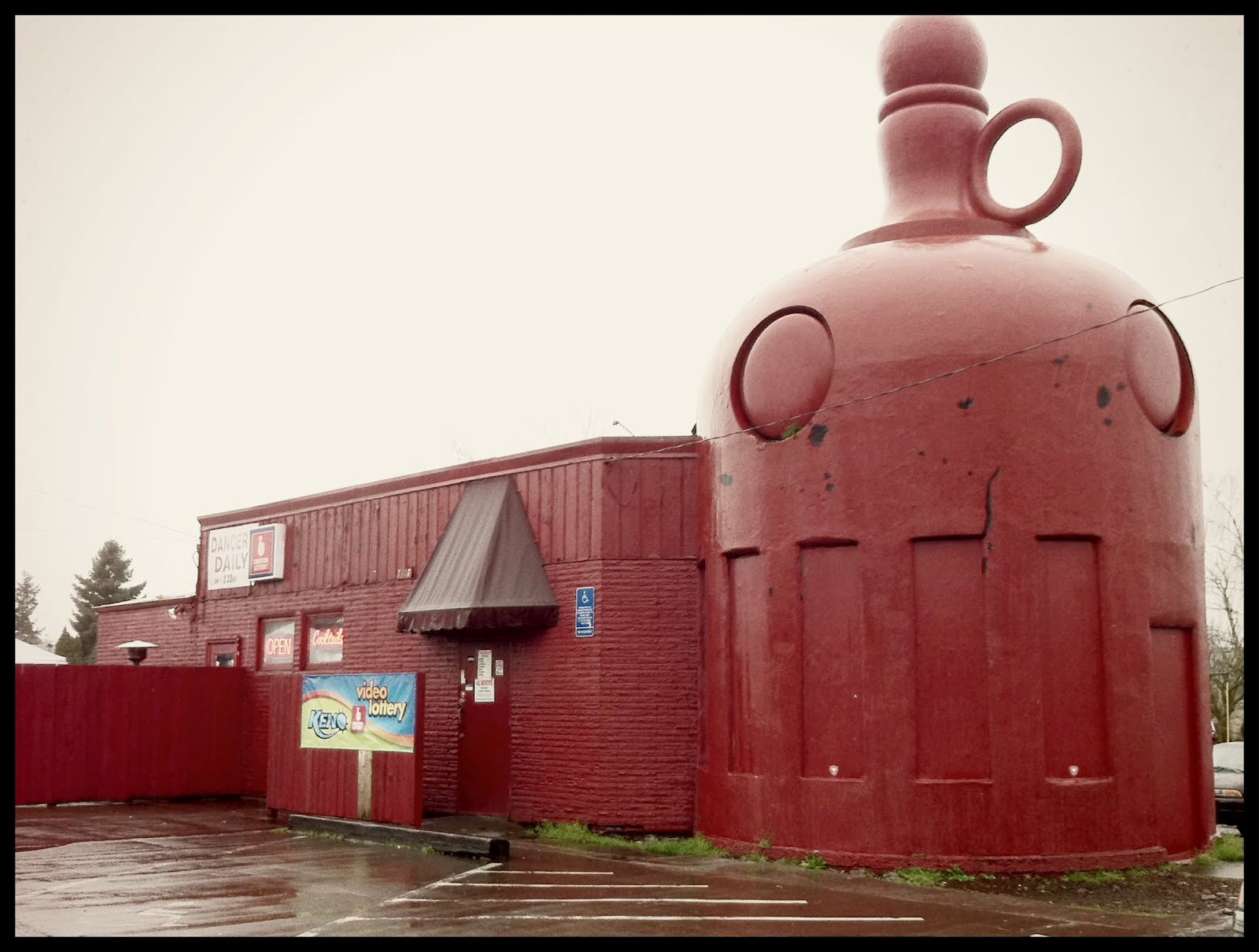
The term “duck” (as inspired by that building) comes from the Venturis’ book Learning from Las Vegas. As pioneers (or perpetrators) of postmodernism, they weren’t making quite the same point Tufte was.
To modernist thinking (which I would say covers Tufte), the problem with the duck is that it’s pointless decoration. The Venturis are super into pointless decoration, they just don’t think it should get in the way of architecture – their solution would be to design a really good duck shop, and then place a giant duck on top of it.
Which isn’t a bad point. It’s not (for most of us) a crime to use illustrations or decorative graphics, and even to combine them with data visualisations, as long as both the decoration and the chart work on their own terms. For example I think this John Maeda thing works well by either or both criteria. In fairness, IIRC, Tufte does make this point too, but his zealots often forget about it.
6 Likes
That’s the rub isn’t it? Good design allows for playful or clever designs that work on multiple levels… but thanks to the Dunning-Kruger effect a lot of designers think that they’re being clever when they’re not and end up making cluttered messes like the one illustrated on the BB post with the car crash.
It’s worse than pointless decoration. The problem is that the entire structure of the building is dictated by aesthetic considerations that are not only unhelpful to, but actually run counter to, the primary function of the building.
Tufte isn’t inherently anti-decoration, but he definitely has strong feelings about form following function rather than the other way around.
1 Like
Bit of a deviation, sorry for that, but I have to ask this:
Duck-related products?
2 Likes
The sort of clients that can’t be dissuaded from the misconception that “giving it a professional look” means use all the fonts!!!
2 Likes

1 Like

1 Like
For those asking wtf is this? Those are Punt Guns, and they are essentially giant shotguns designed for duck hunting. Hardly seems fair though, it’s like going rabbit hunting with a minigun.
1 Like
Wait… I thought that was normal?
1 Like
Perhaps in some areas.
Or what rabbit is doing the hunting

What a punt…
Only when it isn’t Bazooka season.
1 Like
*Not the best quality video but whatevs
2 Likes
I don’t have any bullshit infographics near my house, but I do have a “duck” qualified building. It’s a strip club. Never been inside (honest!), but I can imagine it has… constraints.
2 Likes