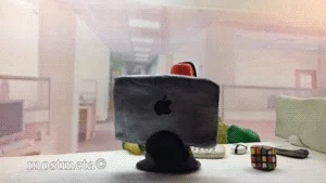
Originally published at: This "Microsoft Redesigns the iPod Packaging" is a timeless classic | Boing Boing
…

Man Dany Elfman killed it with that score - I am listening to “Breakfast Machine” from Pee-Wee’s Big Adventure on loop now.
What’s an iPod?
It’s like a Zune
So my 25yo kid is asking me if I have any of my old flip phones, because he wants to be “more present”. I’ve checked and yes, that’s now a thing among the kids these days.
Confused here: Wouldn’t he be “more past” ?!
Flashbacks to clients opening a design review with “here’s a list of bullet points we’ve come up with that we want to make sure you include” (for something like a 1.5"x3" ad)
I’ve recently started using Window 11. For work, I wouldn’t choose it. Oh my. It’s just so…so hard to use. It’s like someone sat down and tried to make it hard. It’s like we’re racing backwards.
This vid was spot-on. The same thought processes that make that packaging make the whole UI. I’m not always the biggest fan of choices made by the Gnome folks, but they’re streets ahead of MS.
There’s nothing wrong with embracing the past as it never was in order to more properly situate yourself in an imaginary present.
One thing Steve Jobs got very right about early 21st Century Microsoft:
“The only problem with Microsoft is they just have no taste.”
In recent years though, they really have hired some fantastic designers and when Microsoft gets it right - it gets it very right. And some of their product advertising even outdoes Apple:
It’s still baffling that macOS and devices don’t do touch screens.
When Jobs was alive the company’s argument was that sitting down and reaching out to touch a full-size screen was unnatural - but the Surface Studio shows how it could be done.
And in style.
I remember the arguments that the reach was bad UI - and it could have been be if they suddenly dropped touch pad and mouse support. But the variety of Windows devices that make use of it, including kiosks, show that it has a place. And it has been years, more than enough time for Apple to realize it. But they seem fixated keeping touch screen iOS rather than bringing touch screen to MacOS. I worry they will dump MacOS altogether, though. They make most of their money off of phones and the app store now…
“More present” as in “more present in my surroundings in the current moment and not distracted by my phone”.
Maybe I’m in the minority but even with my laptops that have touchscreens I basically never use them. I’m perfectly happy with my MacBook Pro not having any touch support.
That, and

“To make it look professional.”
Its just weird how simple stuff (like transferring a file) isn’t just a different UI but more difficult. And they’ve had decades to improve this. Any time im on a Windows machine, I feel like I’m slogging through mud.
In our house known as “I can’t believe it’s not pretending to be Elementary pretending to be macOS”.
it’s a reel to reel with out the reels