when you say “Latin lettering” … do you mean a phonetic representation?
In Moscow, it is crucial to know at least the phonetics of Cyrillic or you’re f’d for using the subway
also, most fo these tiny, complex and dense maps don’t have room for two words for each stop…
Yeah, I can’t say that the designs presented here are all that much better than the official ones. The London tube map is iconic enough on its own and his new version actually seemed a wee bit more complicated. Same for the Berlin map, one that made me wonder if he broke a very important rule in respecting the line colours that the underground lines themselves use.
Now, if he had done Munich, I might have been able to compare it to the official MVV map, but Munich has an interesting mix of LCR, municipal underground, overground trams, and maps that show various combinations.
Also a case of too late to the game, as nowadays more people are using apps to calculate their connections when getting from Point A to Point B, how long the trip will take, if the trains are on time, and so on. Tube maps are become more of an emergency fallback and less of a necessity.
I think the real subtext in all these subway map redesign projects is fixing New York’s. Its subway map is particularly badly designed, nigh useless to tourists. It briefly had a simplified one in the 70s, but frankly it wasn’t that good: neither as understandable as the London style, nor as comforting as the geographically-faithful one that’s since prevailed. It’s just beautiful, which isn’t the point.
Really? How is New York’s so hard to use? Having an actual map showing me where the lines go is really useful, and beyond that I just don’t see what’s hard to understand about it. Not trying to be snarky, just curious.
Chicago’s standard map (http://www.transitchicago.com/assets/1/maps/ctatrainmap_2013oct.pdf) fails the rules in an attempt to be more accurate to the real map: angled routes follow the streets (e.g. Milwaukee for the blue line), and there is no exaggeration of the size of the downtown Loop (instead, an inset is used). The in-car maps are more schematic – typically a straight line, or line with a loop (for those which go around the Loop), but that’s mainly to fit the above-the-door space.
However, I don’t think it suffers much for these, mainly because of the small number of lines, and that they’re all basically radial from the center. With a few ring or crosstown routes, this would be a lot harder to display… but there’s too much NIMBY to get those built.
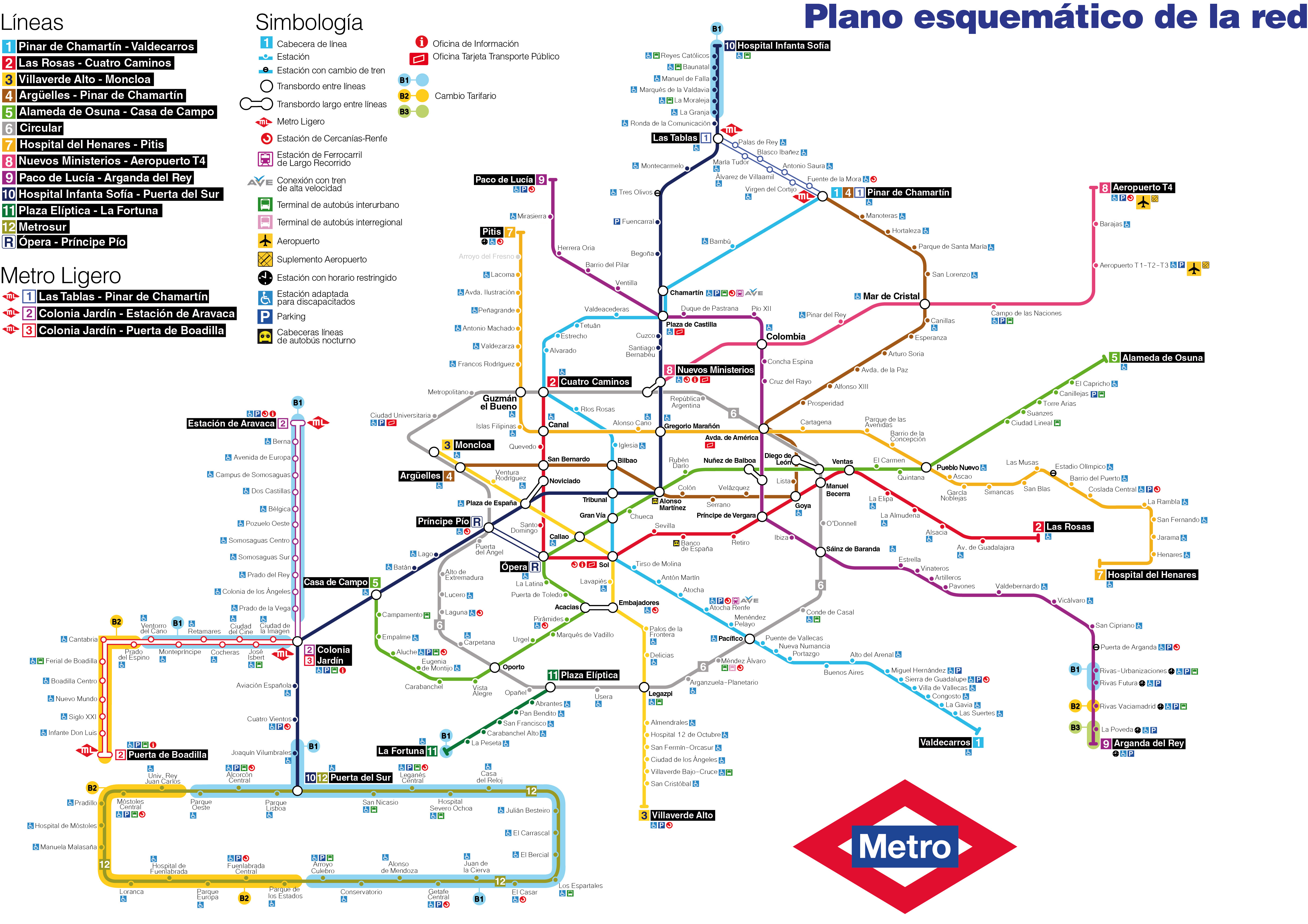
In Madrid they switched from a (stylized) geographically conscious map (http://upload.wikimedia.org/wikipedia/commons/f/f5/Mapa_esquem%C3%A1tico_del_la_red_de_metro_de_Madrid.jpg) to an idealized version (http://www.nocturnar.com/imagenes/mapa-del-metro-de-madrid-mapa-metro-madrid-metro-madrid-mapa.jpg) similar to the one described here . Most people (me included) hated it so they’re going back to the old style now. A map that doesnt accurately (or at least closely) portrays the distance between stations and their position is effectively useless as a map.
A geographically conscious map wont be as clean, pretty or minimal as the idealized version, but remember: function over form. This is extremely important specially when you are a tourist trying to make sense of the city layout trying to find the nearest station.
The problem with the idealized map is that it doesn’t give you an idea of where you’ll end up geographically. People aren’t trying to get to subway stations. They are trying to get to geographical locations.
I feel compelled to defend the New York map. Not as perfect — far from it — but as better in many ways than the abstract maps more commonly seen, and in particular, better suited to the geography of the city than it would be if produced by following these rules or mimicking the London masterpiece. I suppose it comes down to the New York map being the result of different cartographic philosophy.
What the New York map does that many others don’t is integrate the subway diagram with the aboveground geography and roadways. New York, the city, is uniquely suited to this approach. Its “core”, rather than located at the center, is shifted all the way west/leftward, and unusually, it’s not a roughly symmetrical square or circle, but a thin, vertically oriented rectangle. Moreover, unlike many of the world’s cities, Manhattan’s streets are largely laid out on a grid, which the subway lines follow. As a result, the map is able to exaggerate Manhattan’s size — and thus enlarge its portion of the subway map for clarity — while also providing a reasonably accurate and proportional integration of the subway lines with the main north-south and east-west streets. In short, when you emerge from underground here, you not only know where you are in relation to the subway system, you also know where you stand in relation to the city. That’s not something the Underground map and its imitators do well.
Or at least you can know this latter relationship. The New York map does not do the best possible job of making the street-grid clear (the roadways are delineated in a faint grey, for example, and are easy to miss). And you do need to have a rudimentary grasp of the grid to know what, say, the corner of 42nd and 6th means if your destination is, say, 40th and 7th. In this regard, the map is friendlier to locals than tourists. But frankly, I’m fine with that: we residents are the primary users.
Improvements are certainly within reach. The Kickmap is a fine example. It grants each sub-line its own graphical designation, making it easier to grasp that (for example) the N-Q-R trains are largely interchangeable in Manhattan, but split into unique routes in the outer boroughs. Kickmap also offers both a Day and a Night version, making it easier to grasp the many confusing differences in service. (The MTA could also do a much better job with its in-station signage to make day-night differences clear.) But frustratingly, the MTA flatly declined to introduce Kickmap-style improvements a few years ago; just as frustratingly, Kickmap’s creators appear to have dropped the promised Android version, so only iPhone users can carry it in their pocket.
But compared to the Underground map or Boston’s (the other one I’m reasonably familiar with), the New York map is superior as a means of navigating not just station to station, but location to location. London’s and Boston’s fail at many points to make alternative routes clear in the event of a delay on one’s chosen line or inability to easily reach the ideal line. If you can’t catch or reach the 6 to Spring Street in New York, for example, you can easily determine from the map that the R to Prince will drop you off just a short walk away. That’s often not so in equivalent situations using London’s or Boston’s maps.
No map is perfect, obviously (except for the one Borges envisioned!). But all in all, I prefer New York’s approach to the one proposed here. Since we’re on the topic, however, I’d also like to give a big shout-out to Mexico City’s subway map, which in addition to giving each station a name gives each station an icon: either a graphical representation of the station’s name (a rose for La Rosa, e.g.) or a well-known landmark, like a cathedral, associated with it. It’s an elegant way of addressing the needs of locals who can’t read or speak a language other than Spanish, and those of addled and anxious tourists. I’d like to see other systems adopt the practice.
I’ve lived in several cities with a subway - Stockholm, London, Boston, and NYC. I agree with Tim; the NYC map, though imperfect, is far ahead of London’s and Boston’s in usability.
The purpose of a map is to help people trying to reach a location, not just a subway stop. Knowing how the stations relate to the above-ground geography is very important. The London map answers the wrong question.
The London map answers the question: “How to I get to a specific station from the one I’m already in?” It answers that question beautifully.
What people actually want to know is “What are the nearest stations to where I am now, and what are the stations nearest to my destination? Which choices will best serve my purpose in terms of time, fare, and how far I have to walk?”
Subway stations are almost never people’s origin or destination; they are just stepping stones to and from other places.
pgt
My understanding is Mexico City’s reason for using icons was because at the time it was built, a large percentage of the country was illiterate. That’s no longer the case but it has the nice side effect of helping out those who don’t speak the local language. All I need to remember is that I was at the station with a kangaroo. Wish more systems would adopt this standard.
What I really hate are systems with long station names. Atlanta is horrible about this. Dome/GWCC/CNN/Phillips Station, sometimes with Omni in the place of Phillips since that was the name of the previous sports area, is descriptive of what’s near the station but it’s simply not a name that people will use when speaking to each other. There are several other examples of long names in the system that seem to be there more for vanity of neighborhoods than for making it easy to use.
I would like to see the Washington Metro map done in this style. Not because it’s hard to use and needs replacement (it’s not and doesn’t) but because its a design I’m intimately familiar with and such a map would help me to understand the design rules at play here.
Perfectly said. The old NYC map was so distorted as to leave you clueless what actually was the closest stop to your destination. These distortions persist in the current map which has Manhattan stretched far wider than reality, so you can’t judge whether the walk is closer from a station uptown or crosstown to your goal.
I dread a world where the answer to all criticism of information distribution is “why don’t you have a smart phone?”
Man, when I see some of these cities’ subway maps, it really reminds me just how ridiculously small Toronto’s subway system is - especially considering it’s the fourth-largest city (by population, any way) in North America.
I find it’s most useful to have two standardized maps for each city; one that is fairly comprehensive and geographically accurate and one that just shows you how each station connects to another. Take San Francisco’s Muni system for example:

If you were trying to figure out how to get to a specific location or landmark you’d use the map on the left. But by the time you’re on a crowded train car it’s likely you just need to know how soon your stop is coming up or which station you can transfer from, which the map on the right can tell you at a glance.
The London map answers the question: “How to I get to a specific
station from the one I’m already in?” It answers that question
beautifully.
What people actually want to know is "What are the nearest stations
to where I am now, and what are the stations nearest to my destination?
Which choices will best serve my purpose in terms of time, fare, and how
far I have to walk?
Subway stations are almost never people’s origin or destination; they are just stepping stones to and from other places.
That’s elegantly and efficiently put, PGT. And a beautiful distillation of competing map philosophies. Thank you! I’ll keep these in my pocket for future discussions.
On this point, I make an effort to help obviously-lost tourists here in New York, and I find that a significant majority of them are trying to use a certain map. It’s a combination of a fine-detail street map and a low-res/coarsely granular subway map. (Specifically, the subway part displays the routes as very fine, hard-to-read color-coded lines, and doesn’t distinguish between the multiple trains designated by each color.) These maps are evidently widely available, though I believe they’re all copies of a terrific — for locals — map that National Geographic published as a pull-out in the 1980s. Unfortunately, for tourists they’re less than useless; they’re terribly confusing.
So after getting the lost squared away, I always encourage them to take advantage of a little-known service of the MTA. It’s also my number-one general advice to BBers. Namely:
The official MTA subway map is available free, on request, at every subway kiosk. And there’s at least one kiosk in every station. Combined with a street map, it makes the city quite easy to navigate.
So when you’re here, get one. And while you’re at it, get the bus maps for the boroughs you’ll be visiting, too — also free on request. In Manhattan, buses are always slower than the subway, and crosstown buses are often literally slower than walking. But buses are also a cheap way to see Manhattan’s great architecture and observe its colorful people, and in the outer boroughs they’re quick, cheap, and often the only way other than a cab ($$$) to gain access to the neatest stuff on offer.
Rule #1 needs adjusting as it fails in any city in which the “city center” isn’t remotely near the middle. While Vancouver doesn’t have a lot of trains/subways as of yet, the downtown core is almost as far west as you can go without standing in the Pacific. The entire rest of the greater Vancouver region is east/south/north of it. This isn’t remotely unique…
His London map has a circle for the Overgound [sic], but there’s already the Circle Line (not represented by a circle). You can say RTFK (“Read the @#$%ing key”) all you want, but really implementing such a map would be bound to create misunderstandings… unless you renamed that whole damn line to account for the new map.
To be truly useful, NYC’s map would have to be on some kind of magic paper, so that all the sudden closures, re-routes, unmarked detours, rush hour vs. off peak stops and general madness can be accounted for (apps can’t even keep up). I go the same route everyday within a borough, honestly I don’t know how tourists do it, particularly if you don’t speak English…