Originally published at: Dotsies: a font that radically compresses text into the minimum possible number of pixels | Boing Boing
…
4 Likes
The text behind the link lost me once at the word before “teaches”, and it took me quite a while to realise what it meant. I suspect the learning curve is weird, and has some ups and downs.
Fascinating concept. This could be extended by colour-coding some letters, to increase learning and subsequent reading speed.
2 Likes
Looks like a massacre in the Game of Life
16 Likes
Oddly, modern screens are getting considerably higher density and somebody thinks we need this?
There is considerably more screen real estate wasted today with little benefit.
9 Likes
So it’s some kind of 5-bit binary encoding, where the letters aren’t in order? Plus a-e & f-i & others are indistinguishable without a fixed baseline. I think I would have started with a per-letter vertically rotated Morse code.
(This is written from the perspective that this is the kind of tech joke which is funny because of how seriously a ridiculous thing is taken.)
6 Likes
It’s interesting that the example includes what appear to be double or even triple spaces between words. It could be packed even tighter, if that’s the goal.
1 Like
I will stick with International morse code. Or American Braille. I have not looked but I expect a font exists for either.
If you are looking for space compression, I would expect a word translation to a hieroglyph style en-par with Chinese characters. Massive learning curve.
2 Likes
I feel like you might as well just read some floating binary numbers like in the matrix at this point…
4 Likes
The whole thing suggests fiction to me, set in the 1980s (or the eternal 80s of Severance, etc) so you can have dotsies on classic 80 column/320x200 displays and what not
6 Likes
Wow! By overlaying the two different versions (without any resizing) it is incredible how much less space the dotsies version takes up! /s

14 Likes
Yeah, no. The point of computer interfaces is to lessen the human’s workload by having the computer do more, not the other way around. For example, people can get by with sites like Google Translate in situations where they formerly would have had to learn a foreign language. And programmers can use high-level languages instead of having to program in assembly language.
Let the software do the compression and decompression.
6 Likes
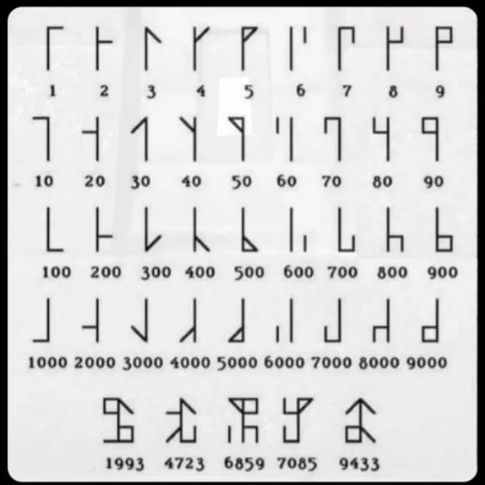
Makes me think a bit of the compact numerical representation system developed by Cistercian monks in the 13th century.
15 Likes

12 Likes
Z̵̠̝̟̩̹̯̝̮̣̹̜̘̺͍̙̎̕a̴̝͚̺͎̖̗̗̻͐l̶̨͈̪̝͕̼̏̽̄͒̅̑͆̏͊͑̚ͅģ̷̨̫̠̠̹͎̺̮͚͋̈͂̓̊̋̀͗̐͂͐͜͝͝ͅô̶̡̢̥̖̰̯̝̦̻̫̯̋̑̓͘͘
11 Likes
You’re probably right about it being fiction. It was unnecessary even before the 2012 date on that web page.
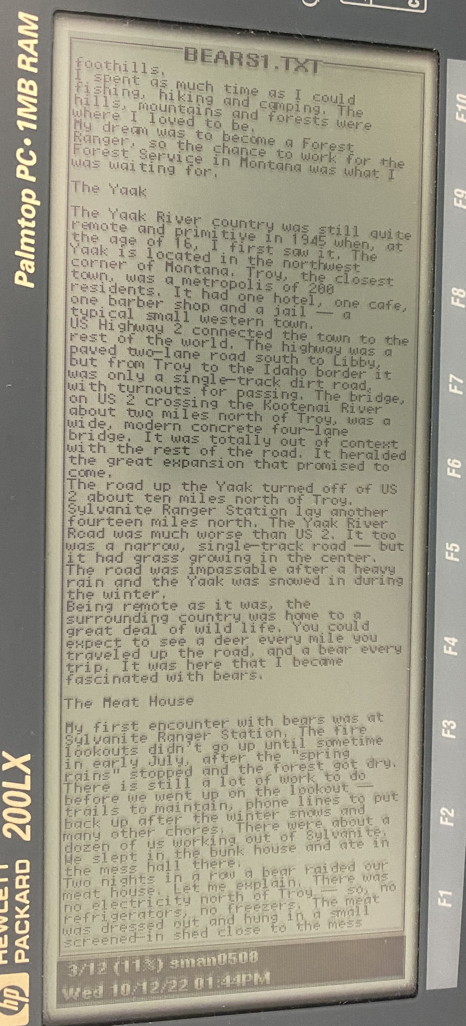
The HP 200LX handheld PC from 1994 had a display of monochrome LCD display of 80 columns by 25 rows; 640 x 200 pixels. It makes for pretty good readability.
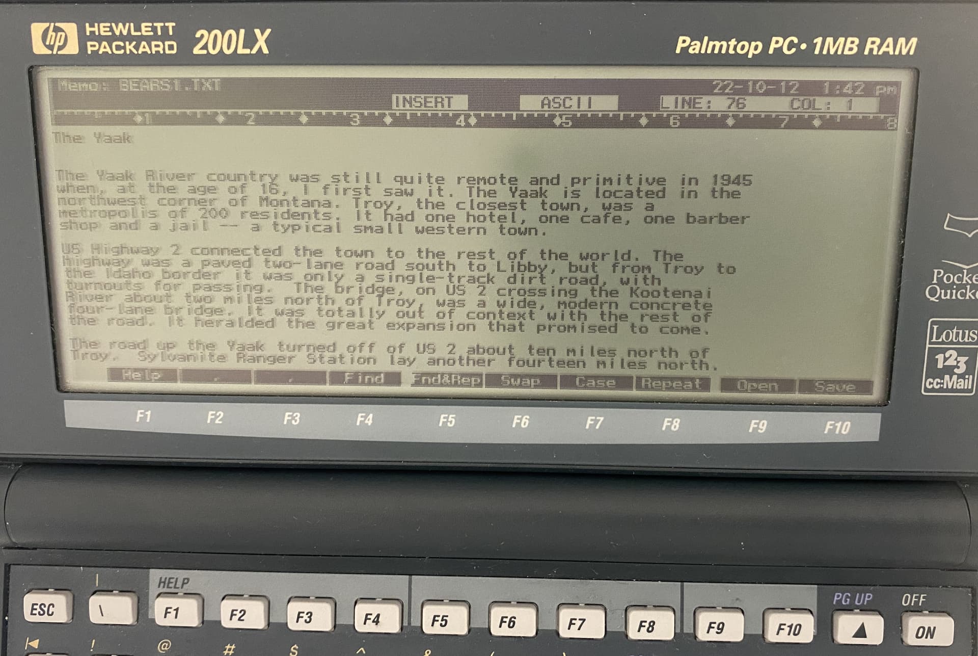
There is a program made for this device that lets you read texts in portrait mode (called VR for Vertical Reader). It allows selecting different on-screen fonts and they can be really dense.

7 Likes
Good luck with that. I’m sure it will take off when metric time does, right after we all switch to Dvorak keyboards.
.
*Don’t @ me, Dvorak nerds. Nobody cares that you use it.
12 Likes
Speaking of foreign languages, diacritics are pretty useful. Sudenly you’re in the position of having to add more bits.
2 Likes
… right after we adopt the 13 Equal Months calendar?
5 Likes
Thanks. I hate it
3 Likes
Dude, where are my Umlauts?
5 Likes