Originally published at: https://boingboing.net/2019/01/20/online-viewer-for-windows-98.html
…
4 Likes
I’m not enough of an OS geek to know this, but when did MS start using the blue screen icons? Was it before Apple started displaying a BSOD for Windows stations and networks? One of my favorite trolls ever.
 https://www.blogcdn.com/www.engadget.com/media/2007/10/generic-pc.jpg
2 Likes
The fun days. I actually still like those icons a lot.
2 Likes
I hope I’m not too much out of line if I plug my latest sound piece here – a collage of Windows 95 raw data (the CDROM as a CD), sound bits, ads, effects, chimes, ephemera and songs (think Weezer ; )
6 Likes
For me they aren’t, except as perhaps a SimCity-esque set of isomorphic furniture/object icons.
Looking at them has always been an aesthetic turn-off, diving me away from Windows.
1 Like
No. They are ugly.
3 Likes
Those icons give me horrifying flashbacks of the ding from hell.
4 Likes
When I upgraded from 98 to XP, I was seriously annoyed that all the icons in the OS had been visited by an uglification expert whose job, it seemed, was to remake every clean bright and clear bitmapped icon using muddy, blurry gradients.
The replacement of a perfectly clear picture of a speaker in the tray with a muddy dark lump of something that I could never identify was the worst, but the whole OS had become less fun to look at.
Fortunately, I found a mod (below) that edited the resources to all the Windows system files in order to restore the 98/2k style icons. And by the time I upgraded to Windows 7, Microsoft had at least partly gotten over its obsession with muddy, indistinct icons.
1 Like
At least Windows 3.0. Blue backgrounds were common in DOS productivity apps, like WordPerfect, Edit, QBasic, Norton Utilities, all the Borlands, and so on, and so forth.
1 Like
Nah, just call them retro and and you can fetishize them like 16 bit pixel art in video games.
Never liked the yellow in them, myself.
1 Like
I kept all the theme pack sounds in my foley folder.
I like computers with sound effects. It’s traditional!
4 Likes
When there’s no wallpaper loaded, windows defaulted to a blue background colour for the desktop for a very long time. Below is a screenshot of Windows 2.0.
White text on blue background was the colour monitor default for simply scads and oodles of text mode DOS apps, so that got used for the text mode portions of Windows (ie, loading screens, setup screens, error messages, etc) for an extremely long time.

4 Likes
Same reason I have settled on XFCE with the default theme and very classic window management metaphors (taskbar, systray, no dock). The over-sharp, unambiguous icons and deocrations really help my productivity.
4 Likes

True, but I think the original intention of these icons were fro DOS programs, as opposed to Windows ones.
Yes, yes and yes!
1 Like
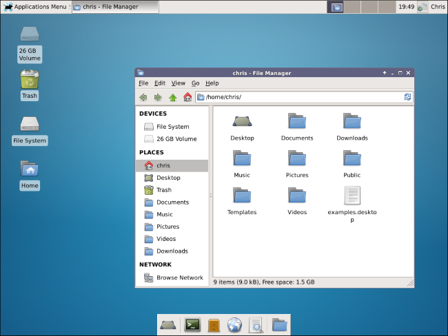
Hola!, fellow Linux user! The diversity of desktops available in Linux is truly a thing of beauty. There’s no wrong way. Personally, I prefer the standard Ubuntu desktop, lightly modified:

1 Like
Hello,
The Windows 95 and 98 (and Me and 2000) icon designs are the way they look for many reasons. One of them is that the icons needed to look good at a wide range of color depths (from 256 to 16.8M colors on screen), which meant choosing colors from a palette which were available at the lowest color depth. Another reason was the desire for skeuomorphic design, such as a file folder for a directory, music note above a CD disc to denote playing an audio CD, a desk blotter to denote the computer’s desktop and so forth.
I could have sworn BoingBoing did a write-up on this many years ago, but cannot seem to find it.
8 Likes
Even if you’re running Windows 10, you already have access to some of these icons in the files %SystemRoot%\System32\shell32.dll and %SystemRoot%\System32\moricons.dll (where %SystemRoot% is usually C:\Windows).

8 Likes