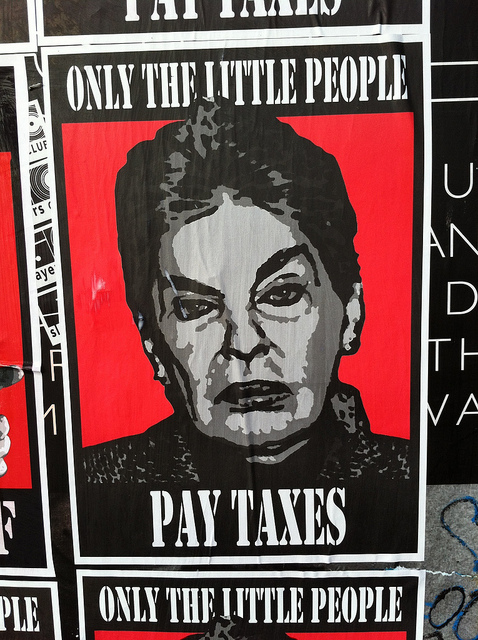
And here I thought taxes were mostly for the middle class…
I hate how you can see how the fabric texture disappears where the logo’s present. Why do so many print-on-demand shirts have this “iron on” look?
I just read the story behind that shirt…
Seriously? You get your renovation contractors to assist you in what is clearly tax evasion, and then you don’t pay the bill?
I… Wow.
What middle class?
It also bothers my OCD that the logo isn’t centered under the neck hole. A little kerning would fix that right up.
The typo in your post is starting to aggravate mine.
“Mossack Fonseca: because taxes are for the poor.”
Using the word people gives the mistaken impression that the poor might actually matter.
/always-the-editor
Yes, you are right, that T-shirt is incorrect.
This topic was automatically closed after 5 days. New replies are no longer allowed.

