No 99% Invisible love? I know there are design nerds around.
pretty cool, but I thought he was going to describe the Chicago flag as an example of bad design… I guess i know nothig about flags.
Regular listener here, and usually catch some back episodes on my commute. It’s possibly my favourite podcast.
Maybe we need a podcast thread?
Hey!
Seriously, did you mean that? Because it’s very symbolic and yet easy to recognize and copy. The highlights of Chicago history in a format so simple that any schoolchild can draw it.
OMG, and here it is at the beginning of the transcript:
Number one, keep it simple. The flag should be so simple that a child can draw it from memory.
Hah!
But he’s wrong here:
The blue stripes represent the water, the river and the lake.
Nope, they represent the two branches of the Chicago River.
Um, yeah-- I was thinking it was overburdened by symbolism, the color scheme is a little muted for my taste, and the six pointed stars are weird.
But, the only two city flags I’m familiar with are the flag of Washington, which is classy,
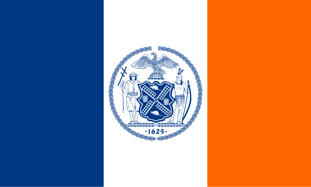
and the flag of new york city, which contains a seal

I agree that the flag of Pocatello is awful

Interesting that Indianapolis is such a good design, when you consider their state flag:

It’s particularly hard to see on the license plates, which is probably why they don’t make them that way anymore.
Oh, and I’ve done a little digging and apparently they’re now saying the two blue stripes on the Chicago flag each represent at least 2 different water features, which seems overly complicated. Top one is the north branch of the river, but then also the lake, and the bottom one is the south branch, and also the Grand Portage over the Sanitary & Ship Canal (which I don’t believe is even within city limits). Way to make it too complicated.
This topic was automatically closed after 5 days. New replies are no longer allowed.
