We’re such adolescents.
4 Likes
Things can be beautiful and useful at the same time.
2 Likes
I’m more of a fan of this typeface, to be honest. Much more accurate.
If some other candidate is better at turning out voters, then why didn’t they win the primary?
9 Likes
I absolutely love the idea behind Decimal and I think the logo is a huge improvement over the previous one. As has been said the angularity of the N is really jarring there. That said I wish the typeface had retained the idiosyncratic A of the original watches. I checked and it’s not available as an alternate either. I think it would have given the logo a charming mid-century industrial feel, conveying themes of modernism and maybe conjuring up memories of a time when a labour movement was a thing in the US. Then again I understand if mid-century nostalgia isn’t the way to go in a campaign that looks to the future and that a lot of the people protesting are looking back on those times as ones of oppression.
I do love the typeface but if the idiosyncrasies of watch typefaces are your selling point leave them in as alternates! Where is the angular G and the wide-stanced M you showed in your examples of watch faces??
2 Likes
Didn’t they already announce the use of this typeface?
One of the two major party candidates is Trump. You’ve seen what damage Trump could do to our economy, reputation, integrity, unity, and just about everything else in fewer than four years. Do you want to try for eight?
4 Likes

6 Likes
I’ll admit that I’m not even sure who is being roasted here? Is it a criticism of Democrats? Of a particular candidate?
2 Likes
It’s in ALL CAPS so the trolls can relate to it.
1 Like
my god it’s like he wants me to skip voting. first he topples the candidate who wants to give us what we want, then he nominates a cop to be his VP.
WHAT THE FUCK JOE THE MOST POWERFUL WOMAN IN THE WORLD SHOULD NOT BE A COP
hmmm … vote for the mafia or vote for a cop? is neither a choice?
fuck this timeline
sorry i just figured out this thread was about fonts. you nerds! where’s the complaining room?! blurg!
2 Likes
I know noone is interested, really, but I’ll say it anyway. Just for the record. I don’t like both typefaces. They both look stereotypical American to me.
But that’s quite probably the point, isn’t it?
And on point as well.
Also, I am very much of the opinion that Biden and Harris don’t rely on any typefaces to win this election.
Win they must. Content counts, not the surfaces.
And when your opponents campaign is just full of shit, your contents will hopefully shine through any surface…
2 Likes
Any discussion of fonts and typefaces reminds me of this… https://www.youtube.com/watch?v=aZVkW9p-cCU
One serious observation about typeface treatments: look at the relative size of “Harris” in Biden’s logo versus the relative size of “Pence” in Trump’s logo.

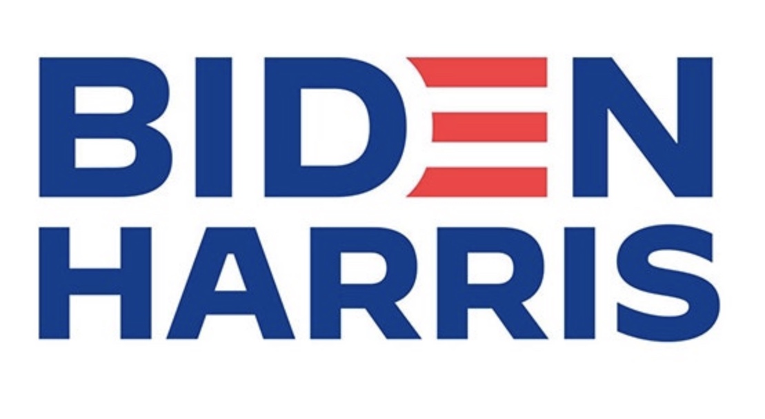
Pence has the same number of letters in his name as Trump, so there’s no reason they couldn’t have equal or near-equal prominence in a rectangular layout.
It’s obvious that Biden’s team wants to make his VP look like an important partner while Trump’s team wants to make his VP look like an unimportant detail.
8 Likes
The logos definitely do. Another variation of the same theme. Red, white, blue, American flag, candidate last names stacked. It’s boring and as you say quintessentially American. But the typefaces themselves, especially the new one look very European to me. I guess low contrast geometric sans serifs just conjure up Central European mid century modernism for me.
1 Like
Yes, but his oak desk!
4 Likes
FYI: There’s an episode of Abstract: The Art of Design on Netflix where Heofler &Co. are designing this typeface and showing what it entails. Fun for typeface nerds and the whole family.
1 Like
Appropriately disgusting.
This topic was automatically closed after 5 days. New replies are no longer allowed.