Originally published at: Explaining the deceptive meme Elon Musk used to whine about media treatment of white people | Boing Boing
…
6 Likes
9 Likes
Which should be exactly what we expected, because the majority of people in the USA are classified as “white”.
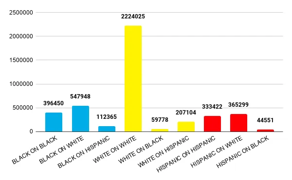
If violent crime was a completely random phenomenon, you would expect every “racial” sub-group to commit crimes in proportion to its population and for the victims to represent the overall population
In short, Elon has been fooled by the mathematical equivalent of background noise and needs to learn to statistics better.
11 Likes
The omission jumped right out at me, as I’m sure it did for most here. That it didn’t for Musk explains – one way or another – why he’s been making some of the decisions he has regarding Twitter.
6 Likes
This talk about “white grievance” suddenly reminded me of the line from the movie “Interview with the Vampire” in which the vampire Lestat listens to the tapes of his companion’s confession and exclaims “Oh Louis, Louis. Still whining, Louis … I’ve had to listen to that for centuries!”
6 Likes
“Fooled” implies that Phony Stark actually is neutral, instead of eager to jump on confirmation of his own biases.
12 Likes
You can take the billionaire scion out of South Africa but, you can’t make him leave his preconceptions. I’m sure he thinks it’s funny.
5 Likes
I’ve known for a long time that statistically if you are white you are much much more likely to be a victim of another white person in a crime. I’ve repeated that fact anytime someone highlights black on white crime etc. I’ve had people scoff and then I link them to the FBI data and they don’t have much of a retort.
Fictional and news media skews our perceptions of danger.
7 Likes
Of course the original chart is D tier. The other chart is still only B tier. Where’s the chart that’s per capita?
2 Likes
Obviously Musk is working in sufficiently bad faith that this barely matters; but is anyone else struck by the fact that none of these charts appear to offer any normalization for population size?
Absolute incident numbers aren’t wholly meaningless; but if you are purporting to make an argument about population-level risk they are pretty close.
7 Likes

4 Likes
There’s a lot to unpack.
Over on Twitter (link in the article), Kareem Carr is doing a great job of (among other things) listing misleading or confusing points about the data, before we make graphs about it. Short version - this is not simple stuff. Anyone claiming it’s simple is either mistaken or lying.


When we see a poll in the news, showing voting intentions, we know the numbers don’t mean much until you break it down by age, income, and lots of other things. Same for crime stats, which isn’t happening here. I wonder why… ![]()
It also happens that, according to the data, white people have a lot more reason to be afraid of white people than of black people, even when you adjust per-capita. But the data presented isn’t “just the facts” at all.
ETA: If nobody was making a big deal out of this data, and someone showed it to me, I’d yawn and say “Wake me up when you’ve compared the numbers across perpetrator age brackets and perpetrator wealth and perpetrator / victim race.” I have a suspicion that once you’ve factored in age and wealth, the influence of skin colour will vanish. As it so often does.
Now that someone is making a big deal out of them, I get to say nearly the same thing, but louder and teaching-er.
9 Likes
This topic was automatically closed after 5 days. New replies are no longer allowed.