Originally published at: This game of 'Operation' makes no sense but Grogu! | Boing Boing
…
2 Likes
If they were going to make a Star Wars-themed version of Operation then a “debug the droid” game would make a whole lot more sense. Remove the restraining bolt, retrieve the star map, clean out the swamp debris, that kind of thing. It could even make an alarmed beeping noise when you screwed up. R2 even has a red light on his face already.

16 Likes
What? We don’t get to do an alien autopsy? Lame
9 Likes
The amount of utter sloth involved product creation never ceases to amaze me (and anger me, when my son winds up with it).
10 Likes
I don’t think i want to find out what R2 would do if I screwed up

3 Likes
We got a copy of Operation for the kids a couple of years ago. Apparently at some point they dumbed down the game and made the holes way too big. First person to go is pretty much guaranteed to win because the sides are so easily avoidable. It was a huge disappointment. It’s not like we bought the special Parkinson’s edition either, it was the generic box, although they had renamed some of the objects from dated 60’s jokes to dated 00’s jokes.
2 Likes
Honestly that’s the way to make this make sense. He was rescued from a lab where they were collecting his juices.
3 Likes
Instead of buzzer noises it could have Werner Herzog monologue about your failures
11 Likes
Real missed opportunity:
You play as the frog mother tasked with retrieving your eggs from his nasty little belly.
Also, I’m apparently one of the very few people who thought that episode was absolutely hilarious.
4 Likes
Agreed, the ridiculously-low effort on display is amazing.
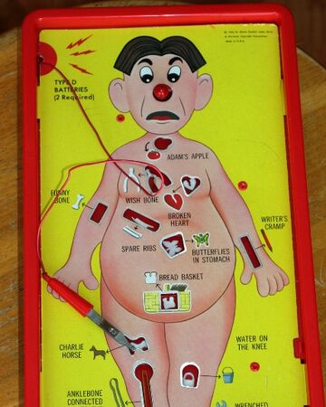
- The holes are placed randomly
- The targets are all roughly blob-shaped
- The holes have to be labeled with what you’re supposed to put in each one because of their lack of identifying silhouette
- The image is completely generic with no attempt made to fit the context of the game
- There are obvious assembly-rivets on the face of the thing in bright green
- The wire cutout is another wobbly blob, no attempt made to fit the image or at least have a tasteful design to compensate
This is atrocious.
5 Likes
“Grogu” …how many lines on the suggestions whiteboard before they settled on that? More or fewer than “Jar Jar Binks”? When Star Wars picks a bad name, it really excels at that. (“what about “Moff …” don’t you like?”)
The image appears more like “Pick The Child’s pockets” than Operation.
1 Like
It’s “Baby Yoda”. That other name is some silly nonsense they made up that you don’t have to pay attention to. 
4 Likes
That’s the business model, at any rate.

5 Likes
I bet it would be trivial to make a vinyl overlay showing R2D2 that could be affixed to an existing game of Operation. Then 3D print appropriate substitute components in place of the organs.
2 Likes
That is all entirely normal for Operation.

That’s the 60’s original. To my memory the plastic posts popped up in the 80’s, replacing the large plastic side tabs that originally held the card in place.
It’s always been a piece of cheap plastic garbage.
I don’t know why anyone expects thought to be involved here. It’s fucking Operation. It’s less a game than a collection of uninsulated wires.
3 Likes
I’d say there are some differences.
- The targets all have unique shapes and their placement makes “sense” in the context of the game (arguably, you don’t need the labels, but they wanted to put the puns in, so they serve an actual purpose).
- Same with the overall image.
- There’s also the little spark-circle design element at the wire attachment point rather than just a random cutout where it would fit. Obviously not functionally different, but the intentionality makes it feel less cheap.
- The rivets aren’t great, but they’re not a high-contrast neon green over a mostly-earth-tones image. None of them are smack dab in the middle of the image, either.
It’s not much of a game overall, but there’s something to be said for motor-control exercises for small kids. Even simple stuff like this can have a decent amount of care and professionalism put in.
2 Likes
Yes “rectangle” and “square” are unqiue easily identifiable shapes. Thus the game did not need to label which piece goes in which target at all! Also vaguely bread shaped hole, which is for the butterfly. Not the bread. For some reason.
There are fewer and smaller rivets (or more posts at that point to my memory) in that image because of the plastic tabs at the side. One of which is broken apparently since there’s a blob of hot glue right next to it, which probably explains the shift. On the later boards the BRIGHT RED rivets stand out as much as they do on Grogu.
The “earth tone” nature of the image is likely do to age. They largely didn’t change the card or board for decades, it’s intended to be nice and bright.
That’s largely my point. It never really did. The original box has something to recommend it as a bit of mid century design. But the game board itself was always pretty roughly and unpleasantly illustrated, that card cheaply printed (and those tabs and rivets used to limit the expense of glue), the moldings were sharp and basic. The electricals flimsy and prone to actually shocking you. We had the early version as kids, even though it was the 80’s because brokeness. Later ended up with a newer one. They were the same cheap, thoughtless sorta thing.
It’s only nostalgia that makes us think of this as any kind of classic. I had more than one art or visual design class in college that used Operation as an example of bad design. Slapping a fresh coat of incongruous branding over the top is pretty much exactly what you’d expect here.
1 Like
They’re not completely distinct, but I’m arguing that for the most part they have uniquely-distinguishable silhouettes, so it doesn’t take a whole lot of logical deduction to know where most of the pieces go by shape alone
Well, that’s garbage then. I assumed the black circles were rivets and the transparent stuff in the corner seems to be a later fix, so i’m not going to pin that on the product design.
Here I was referring to the Grogu picture. It’s browns, darker greens, and white, none of which smoothly fit with bright green Rivets. (EDIT: Brain fart on my part, the green plastic matches the skin tone. They did stick the rivet right in the middle of a brown part though) Ideally the image would be adhered down to plastic so there are no rivets, though I suppose that would be prone to peeling (EDIT:.and costs, as you said).
No arguments there. It’s not a great image. Not offensively bad to my eyes, though, either.
Here I’d make a bit of separation between design and manufacturing. You could have the same visual/play design without the sharp edges or shocks.
Never played this as a kid, no nostalgia.
Genuine question (I’m a programmer with some graphics/UI experience, not a designer): what else made this such a terrible design? I’m not arguing that it’s a great design, but it doesn’t seem all that bad, and definitely noticeably better than this new iteration.
Definitely on-brand for Disney these days.
1 Like