Should have been Oxblood!
So it’s maroon.
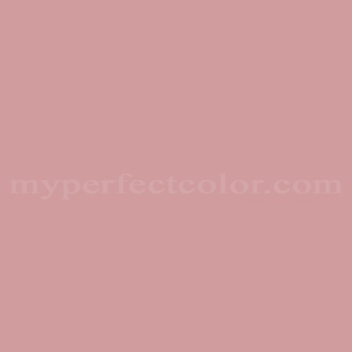
@ Grey, Actually, not quite as self confident as maroon. This is more like a darker version of that dread color of the 80’s that was so inexplicably popular: DUSTY ROSE! This was a sickening, mid tone, grayish-pink seen in horrible wall-to-wall carpeting, floral draperies and cheap polyester bed spreads. ‘Dusty Rose’ was happiest living among bowlfuls of potpourri and Holly Hobby dolls dressed in gingham.
In what way does that color represent marsala?
huh, there are marsala wines and I was thinking masala.
Give me some mud and I will paint with it the skin of Venus, if you leave to me the choice of the surroundings.
Eugène Delacroix
Even if I liked the color, I would have to admire the word-crafting here!
So Pantone gets a bit of publicity. Some models and photographers get some work. I make this obvious comment. Tomorrow is another day and I’ll forget all about it.
wikipedia helpfully notes:
Not to be confused with Masala, a mixture of spices in South Asian cuisine.
Lo, many years ago (but post belt-onions), when I first looked old enough to get into a nightclub, I drank nothing but Pernod & blackcurrant, made out with someone I detested, and was sick that exact colour on my new shoes. Aaaaah, memories…
I thought you liked me!
What a maroon I was…
Yeah, I wanted to make a joke about how it was invented when someone in Birmingham in the 70s added a can of tomato soup to the paint…
TIL…
Not saying I’m a fan of the color, but it would look fabulous on me. Usually the fashion color of the year doesn’t work with my coloring. To me, that’s worth mentioning: this color is not for most northern Euro blondes. Even in the above photos, the blonde is NOT wearing it; only the darker humanoids around her. So, I don’t find this to be a total fail.
Throw some teal in there and party like it’s 1989.
The colors on that last image:

look strangely faded-- as if they appeared in a 1960s issue of National Geographic, or Life magazine. For a company that supposedly prides itself on accurate color, it’s an odd decision.
Well I quite like it. Then again, I like most colors. They’re so colorful.
Perhaps they should have taken a page from Paul Laffoley and chosen “Peach”
you mean, PMS 18-1438. “marsala” may be an evocative word, but designers are not going to be looking through their palettes for it.
and it’s not “dusty rose”, either – which became popular in the 1930s: http://images.myperfectcolor.com/repositories/images/colors/MPC00026314-2.jpg
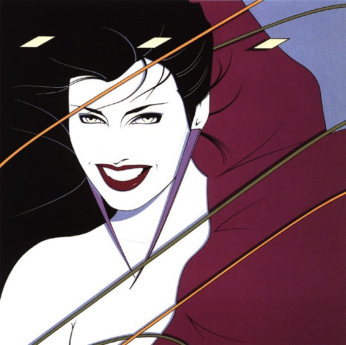
even the 80s Nagel-esque color was different: http://www.arthistoryarchive.com/arthistory/contemporary/images/PatrickNagel-Rio.jpg
Looks to me like a heavy-handed HDR (High Dynamic Range) style image treatment, which tends to ‘flatten’ both shadows and highlights to show details of both at the same time, in a way that does not really happen naturally in human vision. It does tend to look a bit 60-70s faded sometimes, intentionally or otherwise.
This isn’t the “fashion color of the year” it’s Pantone’s:
They basically provided standardized, proprietary colors for graphic design and print purposes. They get a numerical code designation in Pantones scheme and sometimes an actual color name (like Marsala), or uni-code numerical designation for web use. Though the last decade or so awareness/interest in it has risen. So we’ve been seeing a lot more use of Pantone’s colors in home goods, fabric and other areas. This is basically a marketing gimmick to feed into that trend, and likely has little to do with any recent trend for the color under discussion (though I did just see a Le Creuset dutch oven in this color and it was very nice).