Serifs are the new gluten.
4 Likes
Yeah, but that’s really funny when combined with the article I was reading maybe last week about how many companies today are, for no obvious reason, commissioning their very own individual bold sans typefaces.
4 Likes
I wonder if this isn’t being done so that text recognition will work in AR apps. Fonts with actual character might not translate properly to the search term needed to blast an ad in front of your face.
Why stop there?
After standardizing on a single font, we should standardize on a single name:
COMPANY
If this is inevitable,
What will happen to rogerebert.com in 20, 40, and 60 years?

Personally, I love both logos. But, I have to face the reality that the reintroduction of the meatball was not a good sign. At the time, the change seemed to convey the idea that NASA was steadfastly looking forward-- into the rear-view mirror.
7 Likes
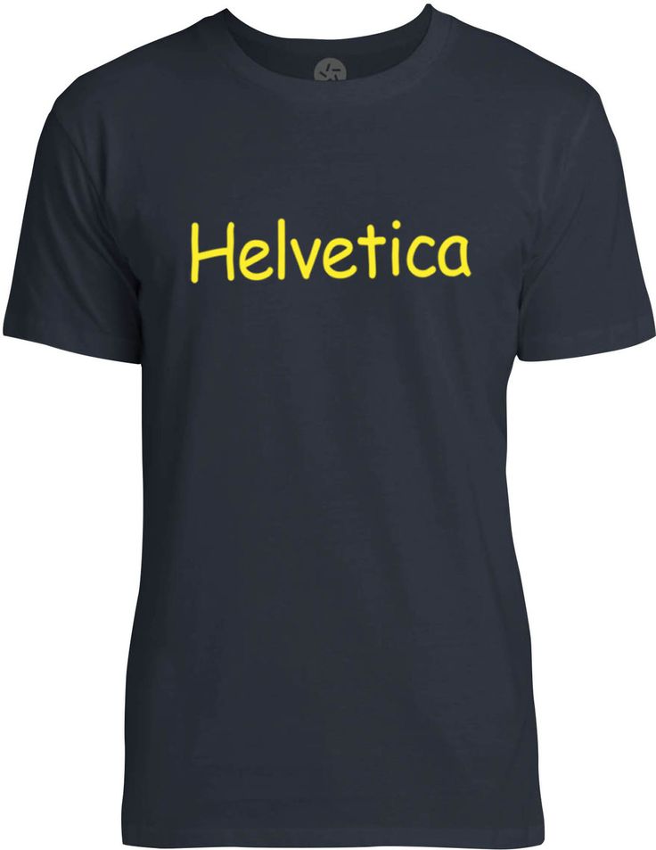
You will submit to Helvetica. Helvetica is awesome. Helvetica is boring. Helvetica is peace. Helvetica cooly embraces us with comforting, yet uninspiring uniformity, freeing us of the cheap thrills and ugly temptations of serifs. All hail mighty Helvetica.
5 Likes

3 Likes
I do recall the fun some bands have when they play in Germany and hear Germans pronounce their names. Or the French, who interpret it as a dieresis.
2 Likes
Perhaps your font manager has gotten ■■■■■ at some point and is now buggy.
1 Like
The most heinous crime in that whole lot is Burberry’s decision to change the text beneath the name from “LONDON, ENGLAND” which is the correct way of referring to the city of London located in England to just “LONDON ENGLAND” with no comma, which looks like the name of a bad James Bond parody.
2 Likes
In the second example they are all much improved except Pinterest.
They say that millennials are killing capitalism. The reality is that capitalists are doing a good job of killing capitalism on their own, by causing less disposable income in the working classes (lower wages, less welfare, etc.). This is why the more aware capitalists think that UBI is a good idea, and would like it to happen before millennials start killing capitalists.
7 Likes
Swiss is weird.
1 Like
Baskerville is the only typeface you need. But I draw the line at anything more modern looking than Clarendon.
1 Like

2 Likes

6 Likes
I could swear that in the leftmost column, fifth from the bottom, that logo looks like it says “Lobster Slaughter.”
6 Likes
If that isn’t a real band name, it should be…
6 Likes
There was more than one Deathfest?
1 Like