that’s one ugly book cover, book’s great though
But is it a Discworld novel ?
Hmm, ‘read the rest’, and its spoiled
I heard the US version is abridged - anyone seen both versions that can confirm or deny?
Funny that I found out when that came out in the U.K. and did not understand the delay out here so I imported the book and pirated the audiobook for my commute.
Why did they delay the book?
That’s a common complaint about the US covers. Here’s the UK cover for comparison.
Cover art is a bit of a minefield anyway. There are so many cliches that get used to pigeonhole books, and publishers obviously have Opinions on what causes a book to sell.
the pictures fine, just the god awful titles look like wordart
I’ll give a word of warning here. Most other discworld novels can be read as stand alone books without losing too much.
In fact I started with “Going Postal” and then back tracked to the Watch Series and started with THUD! which is way out of release order.
.I don’t think I missed much, and have since read them in order.
Now that I think of it, the Color of Magic is probably one of the worst starting places; I remember I did read that one in the 90’s and never touched another
discworld until “Going Postal” and then got really hooked.
However, Raising Steam is very much dependent on having a knowledge of previous discworld books for major plot points, geography, characters and ahhhh’…creatures.
I have no idea. Maybe because there was a follow up book to the Long Earth by Pratchett released in October–which is the traditional time we get a new discworld.
Could be the US publisher didn’t want two books overlapping sales until one had run it’s course.
Ah, American Discworld covers. You’re all so horribly…horrible.
It’s about 2/3rds of one. I’m not a particular fan of the Lipwig books anyway, but this one is sadly the worst. It’s sadly indicative of Pratchett’s illnes; there’s a lot of stuff that needs to be fleshed out, and bits of the storyline that look like they’re going somewhere don’t. The ending is rushed, too. It just sort of, stops.
US covers, especially SF/Fantasy are full-on embarrassing. They’ve always been worse, but my god, the newer ones with the dreadful shooped models on the front, and what looks like MSpaint scenery dumped around them make me nauseous.
In case anyone is thinking of starting on the Discworld novels, this reading order guide is handy.
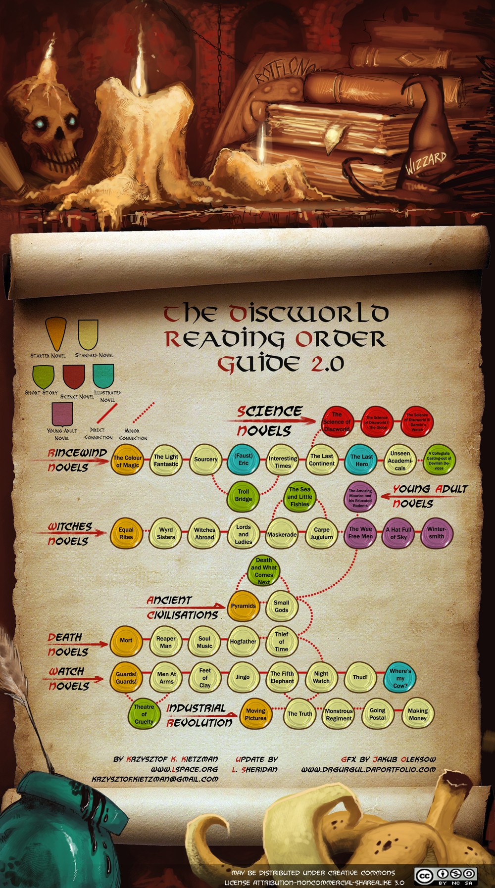
I’m glad to see Discworld keeps going. I agree with another commenter that Colour Of Magic is not a good place to start, but I still like it for its light tone and introduction of Rincewind and Twoflower (and because the Tourist role in Nethack is a gigantic homage to it).
This topic was automatically closed after 5 days. New replies are no longer allowed.