Originally published at: https://boingboing.net/2020/04/10/brutal-chart-shows-all-causes.html
“[D]eaths over the last month dwarf what would be expected from seasonal variations, and look more like a mass casualty event.”
3 Likes
I hear a lot of people complaining that a death plus a positive corona test is officially marked as a covid death even if the patient had a heart attack or stroke or something else. Often it is in effort to downplay the seriousness of the pandemic and further whatever other partisan rhetoric that want to believe.
Tell me medical folks… I’m guessing the flu death statistics could also be “skewed” in the same manner? Like of all the 60k flu deaths a year, could some of those patients also have had other contributing factors?
1 Like
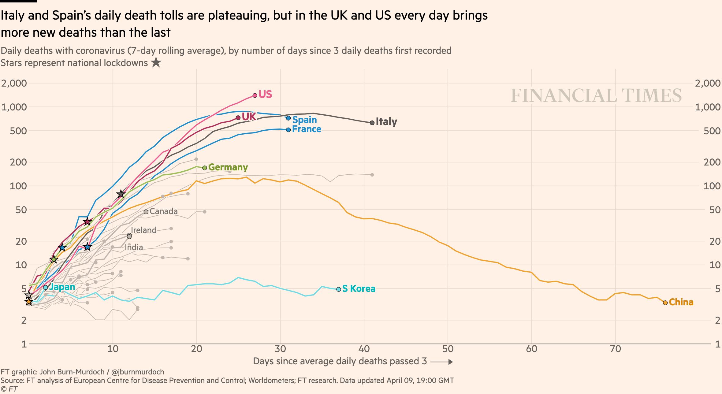
That’s why the graphs are of all-cause mortality. There is no attribution error or bias, just a big spike.
17 Likes
Global mean temperature, unemployment, deaths. Another hockey stick graph that Republicans will try to make everybody ignore.
3 Likes
ok but all other sources say it’s around 5,000 deaths in NY?

I heartily approve of the fact that the y-axis on the chart is zero. No need to play silly graphical games to make make it look even worse - it’s horrifying just as is.
3 Likes
A week or two after Easter we are going to have one 9/11 per day’s worth of death, every day (for the country-wide).
Maybe then those still not grasping this will finally understand.
5 Likes
Exactly. The covid deaths are underreported because of a lack of testing.
The article is about ALL deaths. All deaths have shot through the roof, mostly because of people dying from covid, but also because others didn’t get the care they needed due to covid taxing the health care there.
5 Likes
Trump will shake hands and distribute copies of the graphs to church goers this Sunday. MAGA!
2 Likes
This graph shows all deaths from all causes, not just those that have COVID-19 as a declared comorbidity.
Notice that while September, 2001 doesn’t label the above average spike as “trauma due to collapsed buildings” or “pulmonary failure due to inhalation of debris” or “car crash due to panicked exit from city” or “heart attack watching the news”, it doesn’t have to. It’s not trying to sort out the natural causes from the attack; but we all have external knowledge that helps us understand the reason for that spike.
Similarly, the spike in March 2020 doesn’t have labels that say “COVID-19 related pneumonia”, “COVID-19 related stroke”, “heart attack watching the news” or “car crash en route to hospital for COVID-19 treatment”. The specific causes aren’t important in recognizing that COVID-19 because it’s already identified as a comorbidity factor in thousands of documented deaths for the month; therefore the amount above “normal” for March can be mostly attributed to SARS-nCoV-2 and its overall impact on the citizens.
11 Likes
This is what some of us have been warning of for a while now. The tipoff was similar data from Italy, showing both the COVID deaths and the all-causes deaths. The all-causes deaths tracked the official COVID deaths, but about four times as much. Meaning that for every official COVID death there are three others not counted as caused by coronavirus.
Stop reading now. What follows is really, really ugly.
The supposedly pessimistic 200K dead number (rising every time $POTUS is forced to admit he was still downplaying the severity of the pandemic) is therefore likely to show up as an excess closer to 800K dead – more than the Civil War, or ten times as many per capita.
And that’s optimistic, too. The lowest estimate of case mortality using official (test confirmed) cause of death and incidence numbers is around 0.7%. Herd immunity will start slowing the spread of the disease when we get past 50% of the population having already had the disease, call it 160 million in the USA. Times 0.7% (the most recent Lancet paper on the subject figures more like 1.4%) gets us to 1.12 million, multiply by 4 to account for the undercounting and …
Yeah. Somewhere around 5 million new graves. I told you to stop reading.
4 Likes

The spike in deaths isn’t because of the Chinese virus hoax; it’s because all of the librul cucks getting pwned TO DEATH! MAGA USA HAPPY GOOD FRIDAY!
4 Likes
I’m a little confused. Did anyone read through their data analysis?
First thing that jumps out is a slight downward trend over the 20 years. Mean death rate is going to be a function of population and life expectancy, but NYC’s population has not decreased over that time, so why the downward trend? So I did a quick back of the envelope calc. Mean death rate <5000 per month, 12 months a year, ~8 million people in NYC – thats a mean life expectancy of >1600 months (>133 years). So how is this the total deaths for all of NYC? The pre-COVID baseline should be twice as high
I’m not saying I don’t believe the NYT, just confused.
Any help?
2 Likes
Some people move out after they retire?
6 Likes
NYC skews young, so you would expect a lower death rate than for the general population. NYC has only 5.53% of its population above age 75, which is where the diers tend to congregate in normal times, compared to ~11% for the entire US population.
So old New Yorkers never die, they just move to Florida, and then die. (In normal times, and where ‘never’ means ‘sometimes don’t’.)
6 Likes
Thought of that, but ~40% of residents would have leave before death. Maybe that’s the case, but just seems remarkable
1 Like
They don’t have to move all the way to Florida. Moving out of the city to New Jersey, to a retirement home or other place where we warehouse old people out of our sight-and-mind, would do the same thing to the statistics.
4 Likes
It’s not just retirees. It is also young people moving to jersey to have kids. 40% is not unreasonable.
1 Like
I call shenanigans. He has never admitted he did anything wrong about anything ever.
4 Likes