Originally published at: http://boingboing.net/2016/07/28/the-typography-of-stranger-thi.html
…
2 Likes
unadulterated typographic porn.
So early in the day?
5 Likes
It’s weird that suddenly there are all these sites analyzing the typography of TV shows and movies. Why are people starting to look at it just now?
The font reminds me of the kind of typography on many old school Stephen King novels. Though i have seen similar fonts used for all kinds of books, but i get a pang of Stephen King nostalgia for the most part.
4 Likes
That’s kind of the point, which is addressed in the linked article.
Before I watched the show, I legitimately thought King was involved in some way. They deserve a lot of praise for nailing that aesthetic, not just for the title/typeface, but for the feel of the whole show. I’m a big fan of those King novels from that time period, and they had ME fooled.
2 Likes
Stephen King agrees:
More generally, it’s the '80s movie that '80s movies wanted to be, including that title sequence, which is sooo '80s, from the typography to the film grain and video noise. (I wonder if future video will add compression artifacts for nostalgia’s sake…)
5 Likes
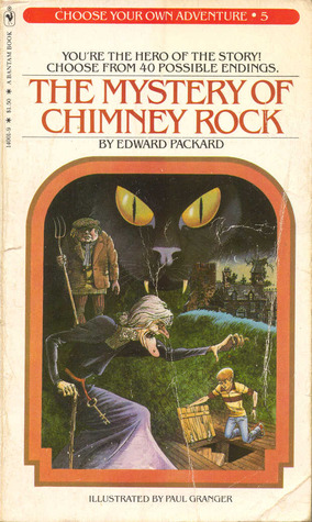
Super sexy. Benguiat will be familiar to anyone who grew up on Stephen King or, for that matter, the original Choose Your Own Adventure series.
9 Likes
Mmmm…good kerning.
I’ll be back in a few.
8 Likes

My thought as well. It’s absolutely incredible how they manage to make it a period piece without dipping unnecessarily into nostalgia. At no point did I feel like the directors were screaming “Look! Remember this!” Everything served the story, and that’s how you do it.
Also: can we give an Emmy to all of those kids as an ensemble?
2 Likes

I could swear I just had this exact conversation yesterday…

5 Likes
The title sequence definitely stirred something nebulously nostalgic deep inside me. I couldn’t place it at the time, but there was something that reminded me in equal parts of the covers of Stephen King and Choose Your Own Adventure books.
Which, incidentally, is almost exactly the place in my brain that this series occupies: scary, darkly humorous, and yet like a deep, sweet swig of my own distilled childhood.
2 Likes
But is it better than Garth Merenghi’s Darkplace?
1 Like
Yeah, there were a lot of references to '80s movies (as detailed in a previous post), but they were subtle and non-distracting
Millie Brown showed she was pretty darned impressive in her earlier series, where she played a middle-aged man. (Not kidding.) But yeah, all the kids were good - another way it was the '80s movie that '80s movies aspired to be; they could rarely get one child actor of that caliber.
missed that. I wish it were easier for us to shove BBS comments back to Wordpress as new posts.
4 Likes
Old Call of Cthulhu RPG books too; have a look at some of these:
http://www.waynesbooks.com/ClassicScenarios.html
Some of the initial letters are a bit fancified, but they’re members of the same typographic branch, I think?
This topic was automatically closed after 5 days. New replies are no longer allowed.